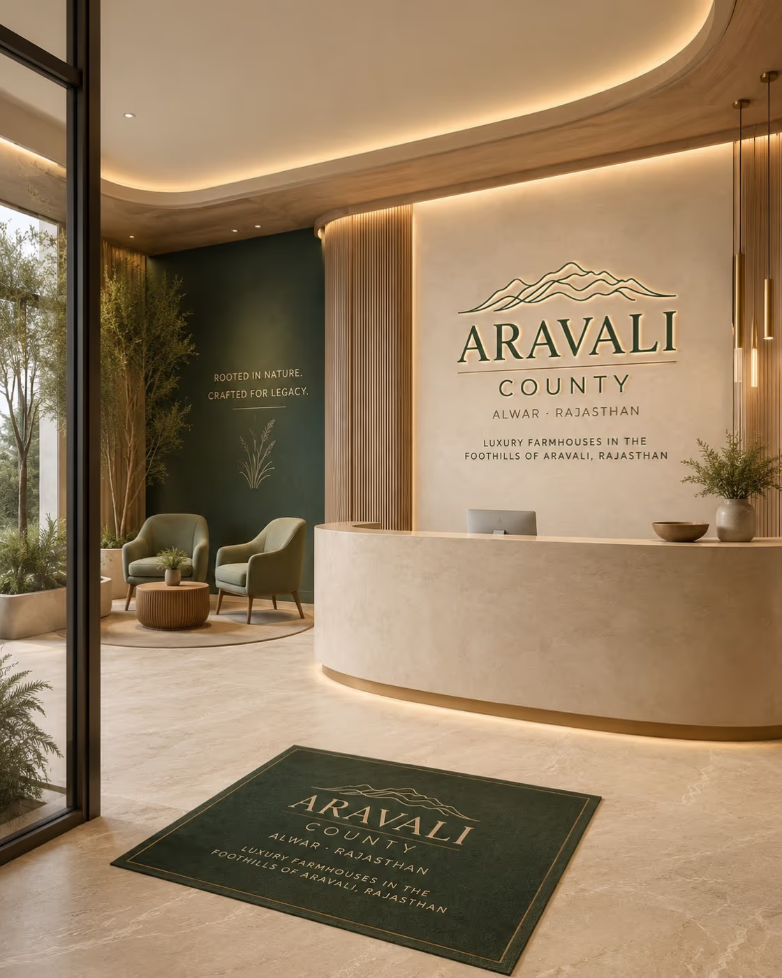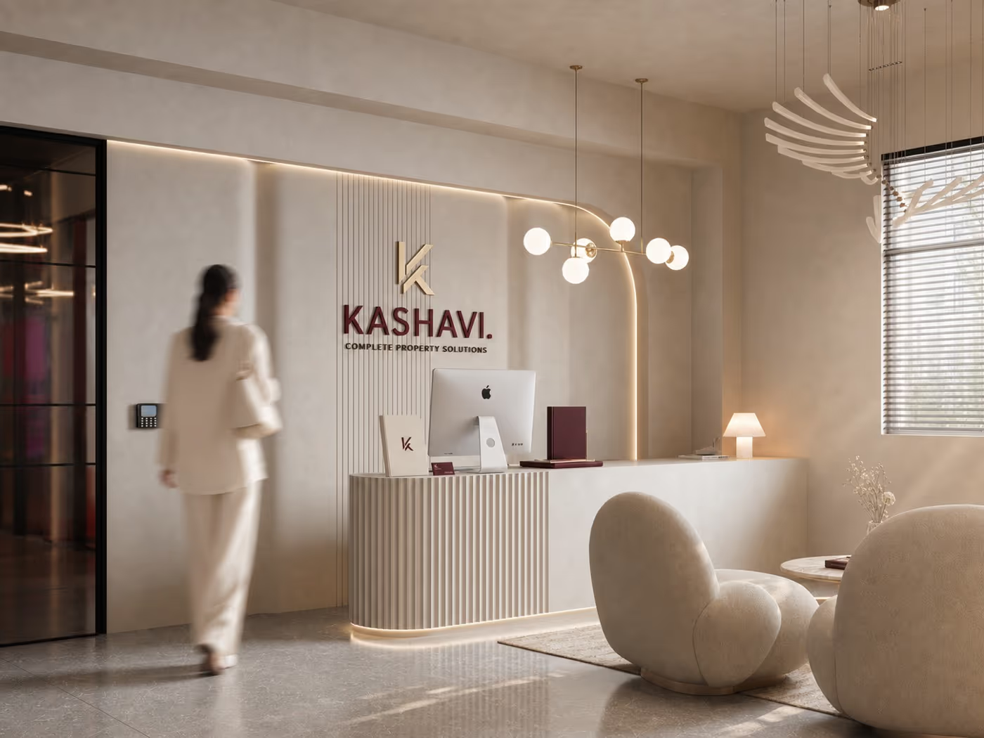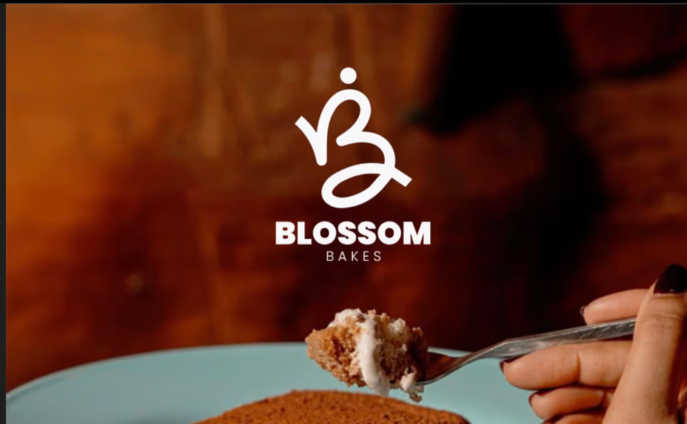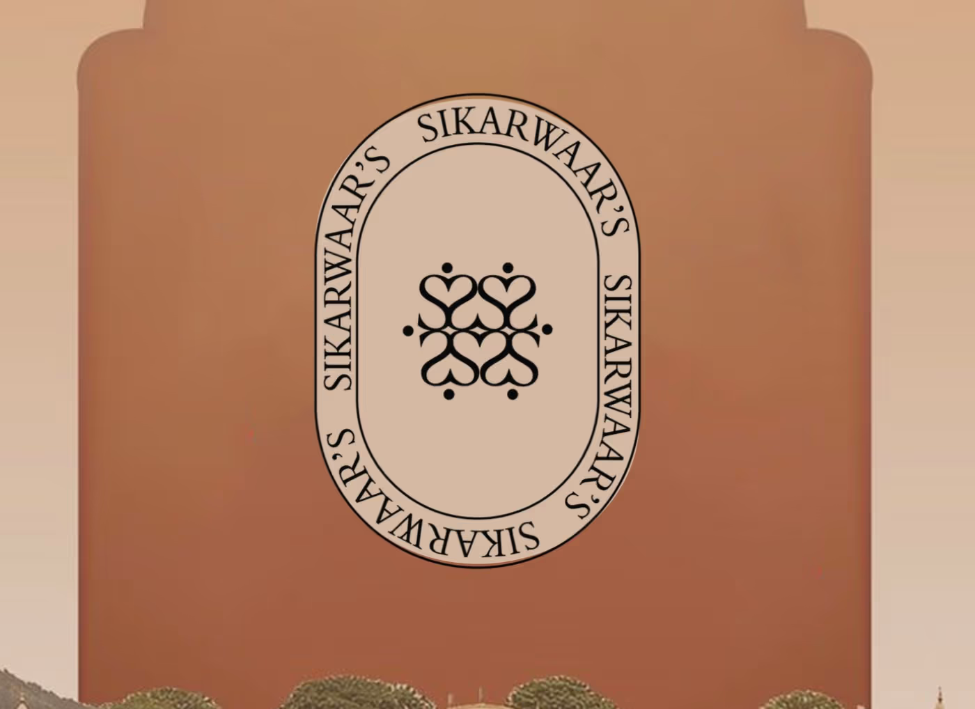
The Work

Brand identities, packaging and places by Northkind. Explore the selected projects below, see the films we produce, or read about the studio.

Northkind · Brand studio Built for the real world

Branding & Brand Identity Design

A name. A feeling. A whole world.

We build identities that stay with people. From the first mark to the box they take home, every detail belongs to the same story.

Naming, identity systems, packaging, collateral and signage. Based in Fatehabad. Working across India.

Explore the possibilities
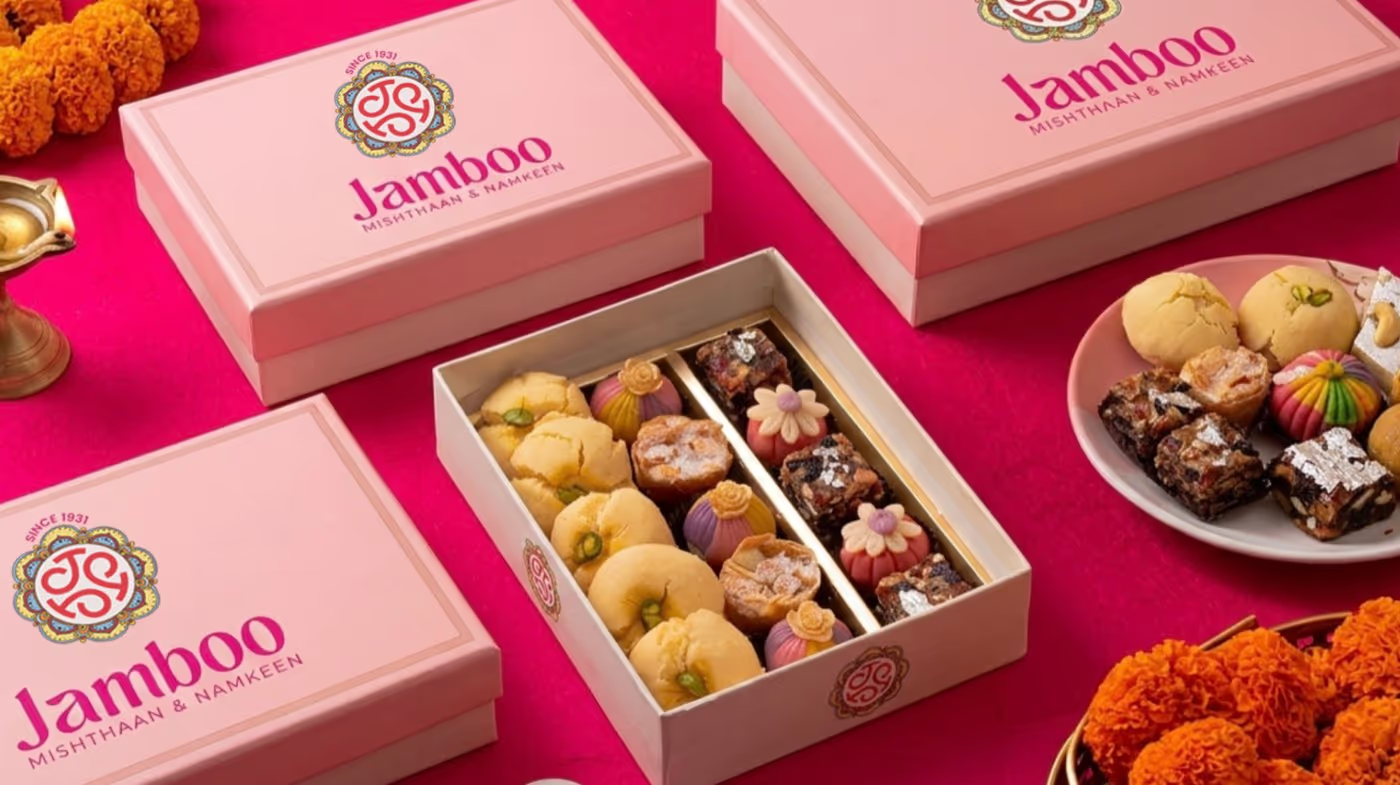
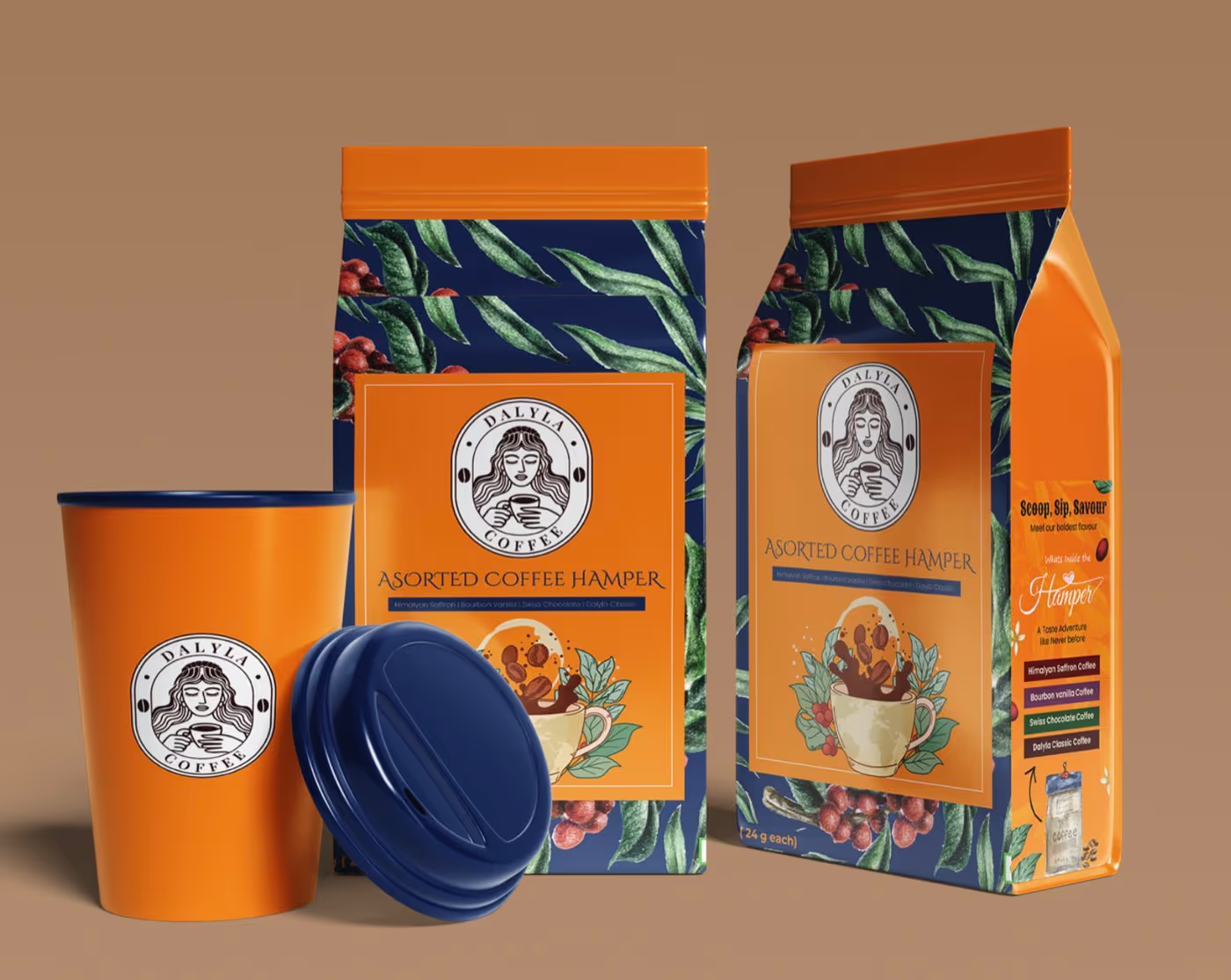
Jamboo’s illustrated gift boxes, designed as one coordinated packaging family
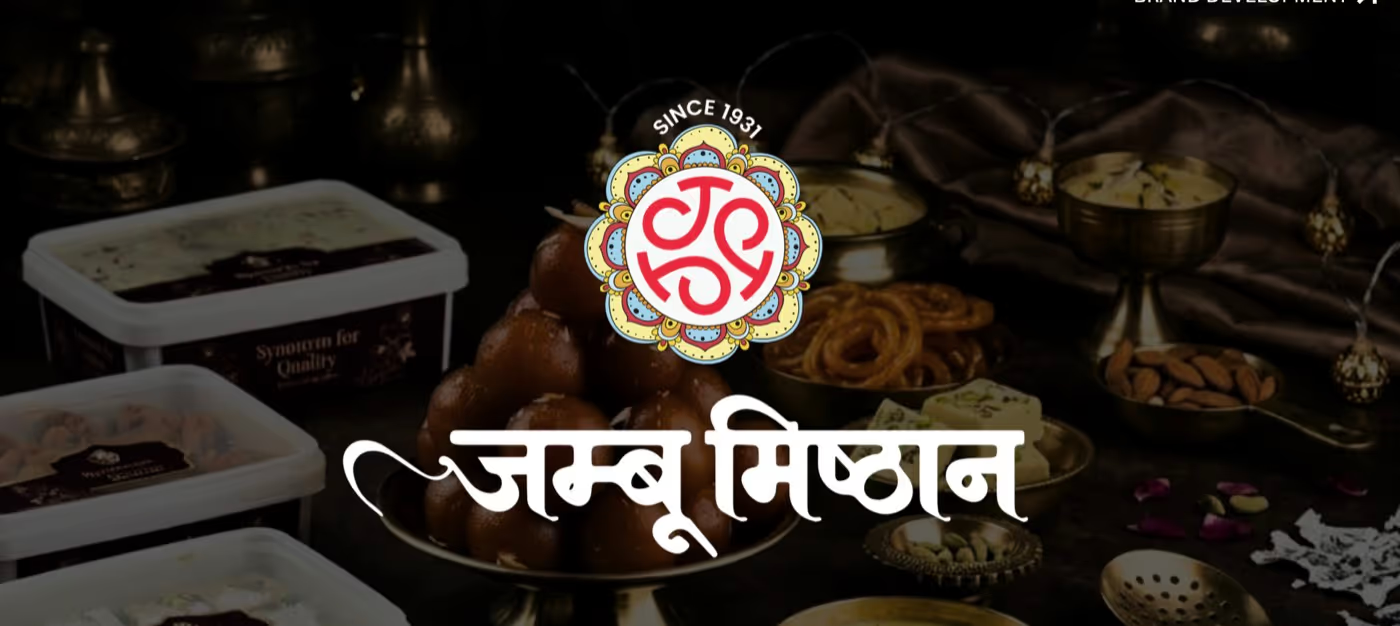
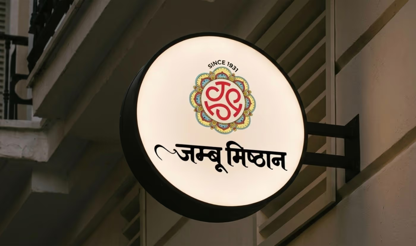
Jamboo wordmark and identity
In practice / JambooView the brand ↗
Recognisable on a shelf.At home on a screen.Unmistakably yours.
01 / The building blocks Five parts. One identity.

Every touchpoint.
The same feeling.

A good identity travels. Open a discipline to see how we carry it from an idea into the world.

01

Naming

Names that survive a trademark search, a phone call and a shopfront. We work from what the business actually does and who it sells to, generate in volume, then cut hard — saying each candidate out loud, setting it in Devanagari and Latin where both matter, and checking the domains and handles still free. You get a shortlist you can defend to a board, not a page of clever words.

Positioning · Shortlists · Language checks
02

Identity systems

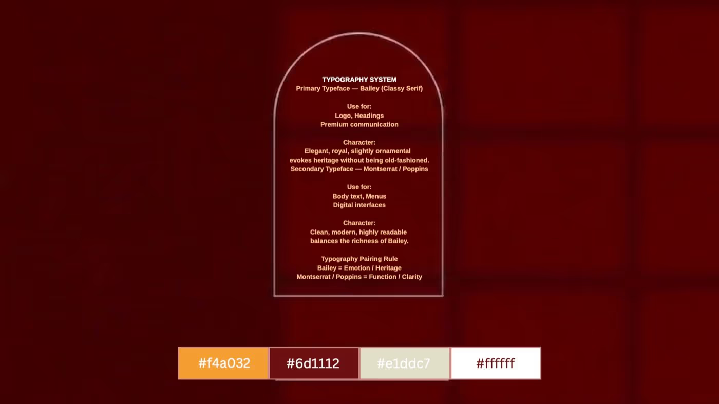
A logo is one asset; the system is the whole set. Primary and secondary marks, a type scale, a palette with real usage rules, and the construction drawings that keep the mark correct at 8mm and at eight feet. We document what happens on dark backgrounds, in one colour, and when someone on your team has to build a slide without us. That document is what stops a brand drifting in year three.

Marks · Typography · Colour · Guidelines
03

Packaging

Packaging is where an identity meets a printer and a production tolerance. We design for the substrate and the process you are actually buying — offset, flexo, digital — supply dielines that fold, and specify finishes checked against a real quote. Labels, cartons, sleeves, bags, boxes. You get print-ready files, and we stay on the phone with the press through the first run.

Labels · Cartons · Bags · Gift boxes
04

Collateral

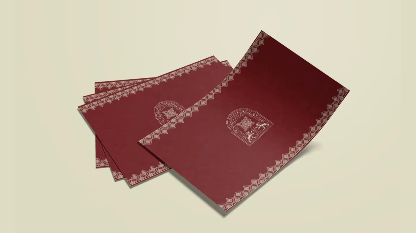
The pieces a brand is judged on day to day: menus, brochures, stationery, invoices, cards, uniforms, price lists. These are the highest-volume surfaces most businesses never design properly. We build them as one set off a shared grid and type scale, so a business card and a forty-page brochure read as the same company, and we leave editable files for the ones that change each season.

Stationery · Menus · Brochures · Uniforms
05

Signage

Signage is the brand at its least forgiving — fixed, lit, and read from across a road. We design for the sign maker: exact dimensions, material and finish call-outs, illumination type, mounting detail. Blade signs, fascia, wayfinding, window graphics, interior feature walls. Sightlines and viewing distance get checked before anything is fabricated, because a sign is the one asset you cannot quietly reissue.

Shopfronts · Wayfinding · Window graphics
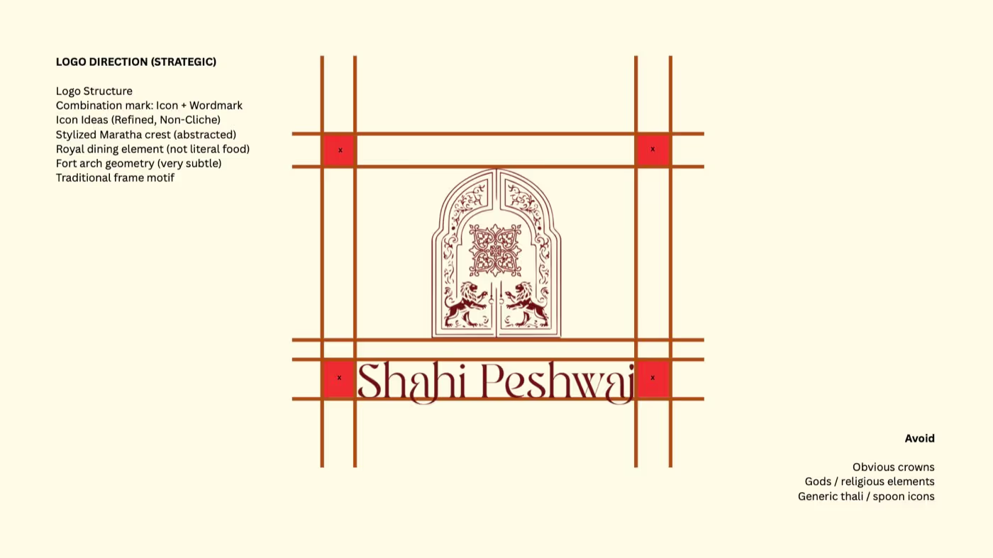
Identity exploration for Shahi Peshwai, with architectural references and wordmark studies
Shahi Peshwai · Finding the idea
The details make the difference.
02 / From the first conversation To the first impression

Clear thinking.
Considered making.

Four stages, with a reason behind every decision. Here’s how the work takes shape.

Discover01 / 04

Before anything is drawn

We start with the business, not a moodboard. What you sell, at what price, to whom, and who else is chasing that same customer. We look at the category the way your buyer does — walking the aisle, scrolling the feed, driving past the sign. What comes out is a short written position: what this brand stands for and what it will not do. Everything after is measured against it.

A clear position for your business.
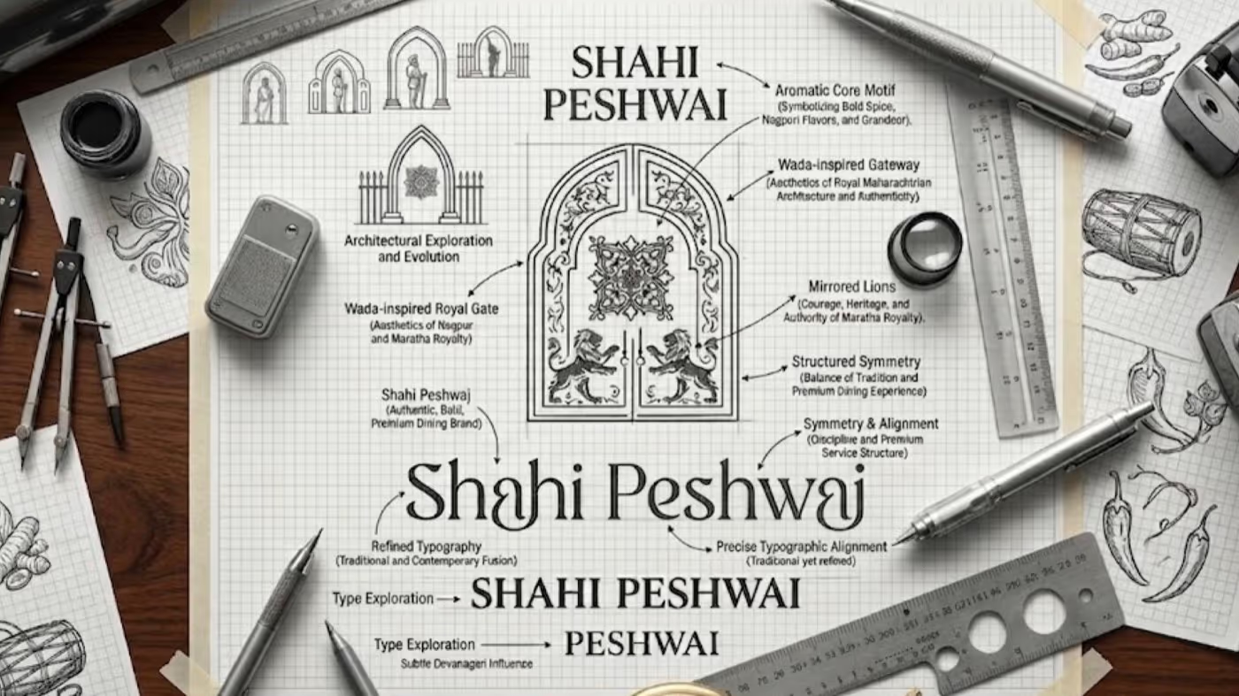
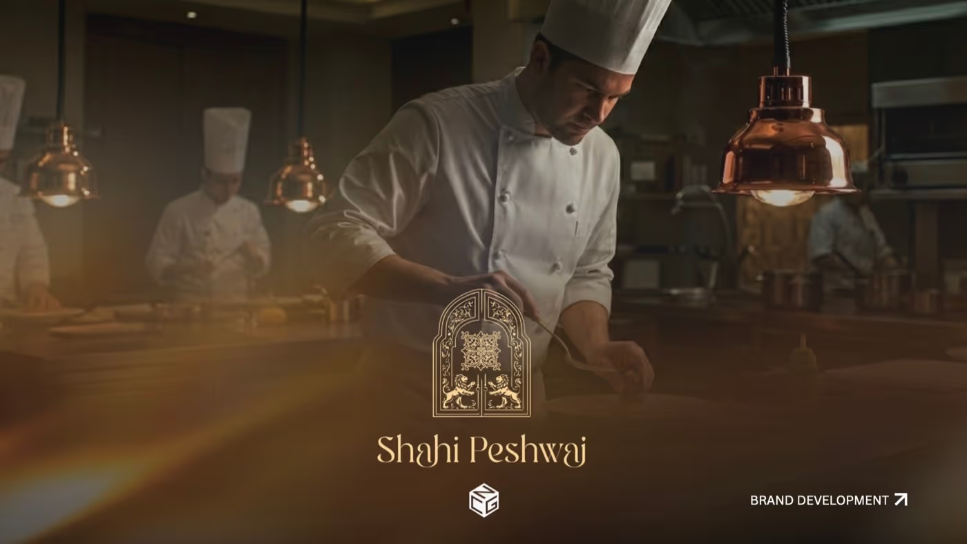
Shahi Peshwai: discover stage, from identity exploration to application
Inside a brand / Shahi Peshwai
Define02 / 04

One idea, three directions

We come back with three routes, each built on a single idea you can say in one sentence — not three colourways of the same logo. Each is shown where it will actually live: on the pack, over the door, in the hand. A mark judged on a white slide tells you nothing. You choose one, and we tell you straight which one we would take and why.

A direction with a reason behind it.
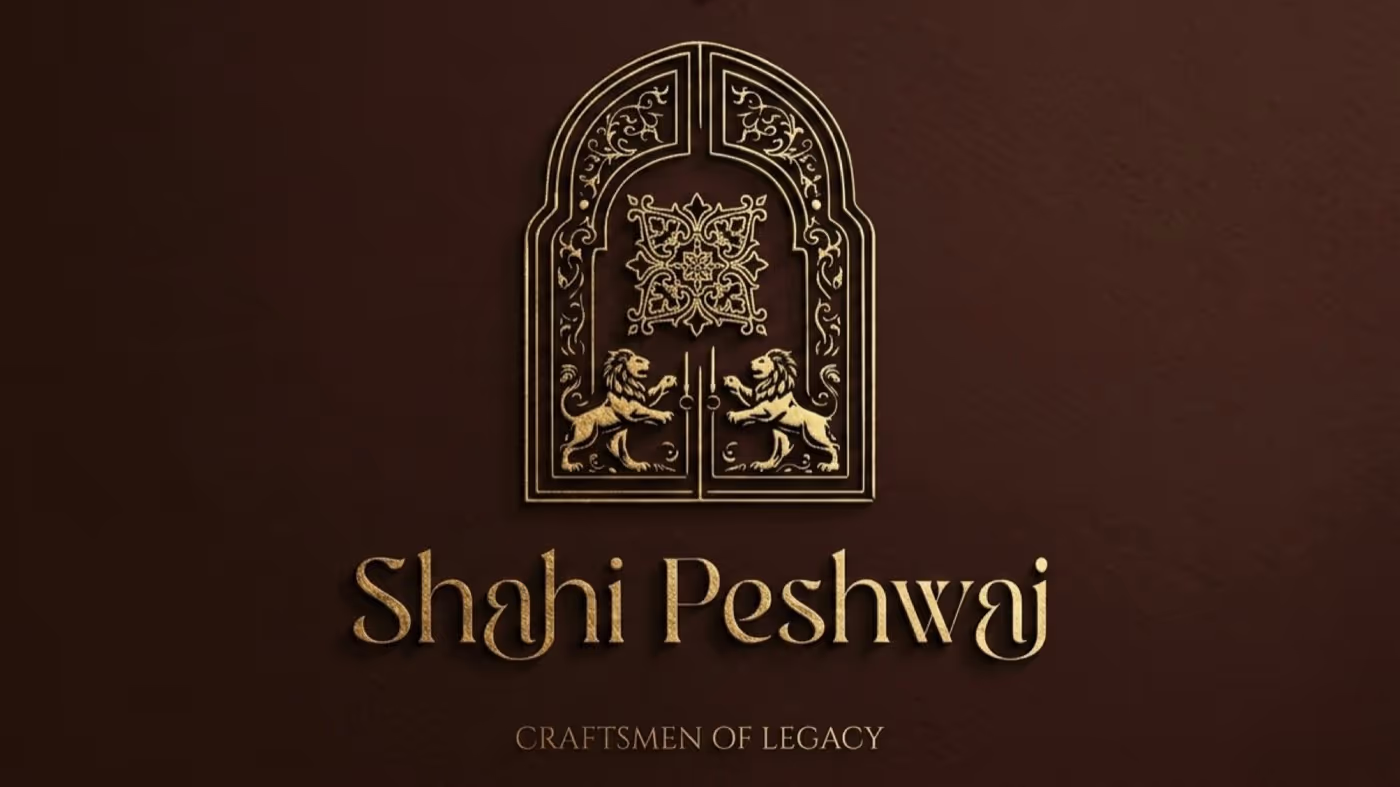
Shahi Peshwai: define stage, from identity exploration to application
Inside a brand / Shahi Peshwai
Develop03 / 04

Building it out

The chosen route becomes the system: construction, type, palette, usage rules, then every deliverable in scope. This is the longest phase and where most decisions get made. You see work weekly, in a form you can react to. We would rather show something unfinished and be corrected early than present a polished thing you have to unpick. Revisions are part of the phase, not sold back as extras.

One consistent visual language.
Shahi Peshwai: develop stage, from identity exploration to application
Inside a brand / Shahi Peshwai
Deliver04 / 04

Handover and the first run

You get the files — working and print-ready — the guidelines document, and the fonts licensed in your name rather than ours. We brief your printer or sign maker directly and check the first proof. After that the brand is yours to run, and we will tell you honestly whether you need us again at all. Most clients do not for the first year.

A brand ready for the real world.
Shahi Peshwai: deliver stage, from identity exploration to application
Inside a brand / Shahi Peshwai
Rooted here. Ready for everywhere.

Branding for businesses in Fatehabad, Hisar & Sirsa

Local context matters: the shopfront, the language, the people who will pick your product off a shelf. We bring that understanding to the identity.

Based in Fatehabad, working with businesses across Haryana and the rest of India.

Digital marketing in Fatehabad Let’s talk about your business
FatehabadThe studioHisarSirsaHaryana → Across India
04 / Your next chapter Start with what you need

Where should we start?
Let’s define the scope.

A focused identity and a complete retail rollout are different projects. Select what you have in mind. We’ll work out the right scope together.

A defined scope, agreed before anything starts.
Clear deliverables and a dated schedule.

Packaging ranges, bilingual naming and multiple locations add to the scope. An existing name or a phased rollout can keep it focused.

What are we building?

Choose any that apply.

Your starting pointIdentity systems

This carries your selection to our contact form.

05 / A little clarity

Good questions.
Straight answers.

Have something else in mind? ↗
01

How long does a brand identity take?

Six to ten weeks for a single-location business, longer if packaging or signage across several sites is in scope. Naming adds two to three weeks. You get a dated schedule before the work starts, and we tell you early if anything slips.

02

Do we own the logo and the files?

Yes. On final payment you own the marks and the artwork outright, and you get working files, not just exports. Fonts are licensed in your name — we do not keep you tied to our licences.

03

Can you work with a name we already have?

Often that is the better option. If the name is working, we keep it and put the work into the system around it. We will say so plainly if we think the name is the actual problem.

04

Do you handle printing and signage production?

We do not print, but we manage it. We brief your printer or sign maker, supply production-ready files, check proofs, and attend the first run where it matters. If you have no supplier, we recommend one we have used.

05

What if we only need a logo?

We will tell you if that is genuinely all you need, but it rarely is — a mark with no type scale, no colour rules and no application guidance tends to come apart within a year. The smallest project we take is a mark plus the system that keeps it consistent.

Chat on WhatsApp