Your logo is not your brand
A logo is one drawing. A brand is that idea on the signboard, the menu, the carry bag and the apron, until people know you before they read your name.
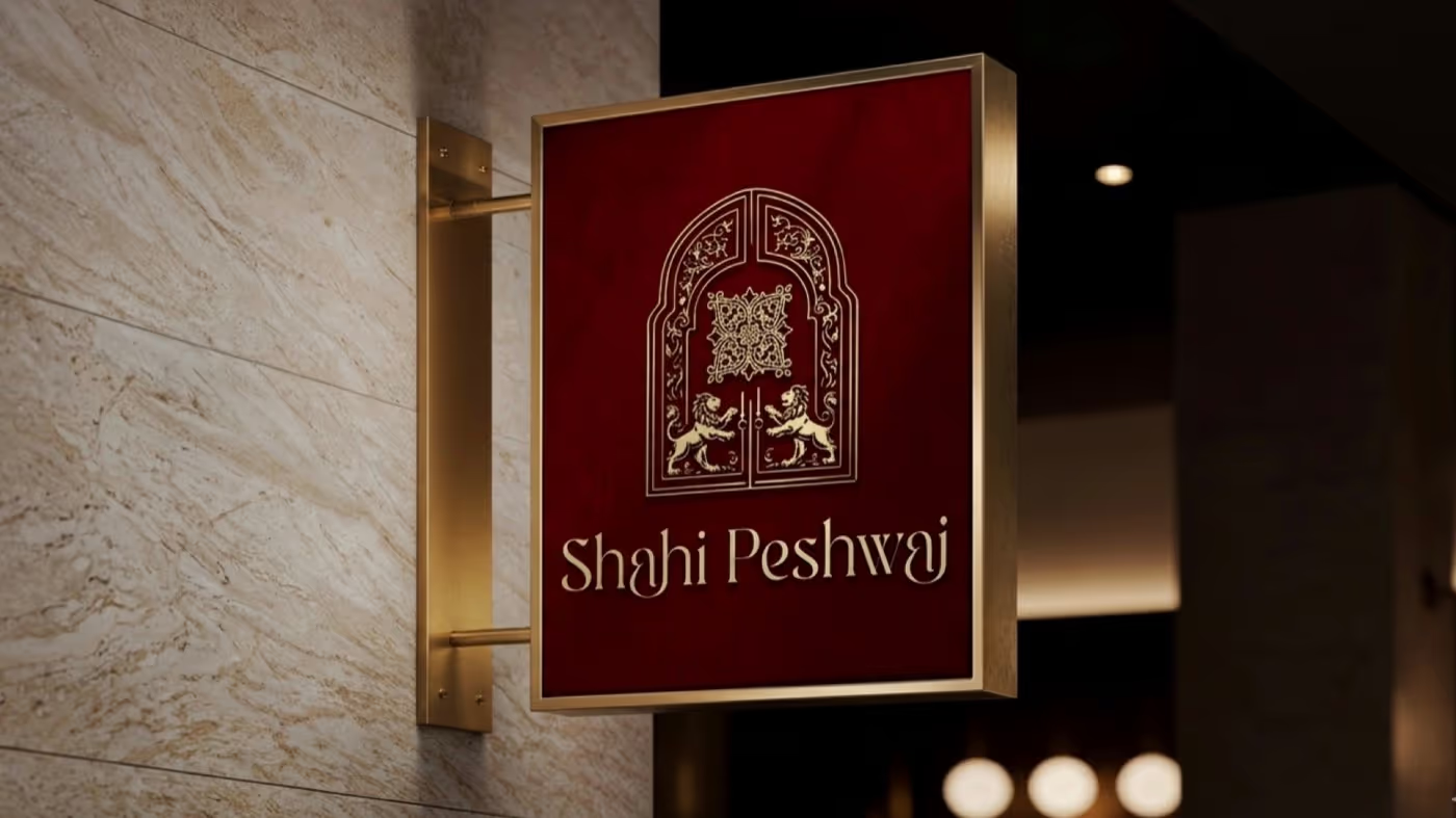
Most businesses in Haryana get a logo the same way. Someone's cousin makes three options on a Sunday, the owner picks the one in their favourite colour, and it goes onto a flex board by Tuesday. Then the visiting card is made by the printer, the Instagram posts by whoever is free, and the shopping bag by the bag supplier's in-house designer.
Six months later there are five versions of the business in the market, and none of them look related. The logo is fine. The brand never showed up.
What a brand actually is
A brand is the feeling a customer gets before they read your name. It's built from repetition: the same shape, the same colours, the same type, the same tone of voice, carried everywhere you touch a customer. The logo is only the most compressed version of that idea.
That's why we don't start a project by drawing a logo. We start by finding the one idea the whole system can grow from. For Shahi Peshwai, a Maharashtrian fine-dining house, that idea was the palace gateway: the arch of a wada, guarded by a pair of mirrored lions.
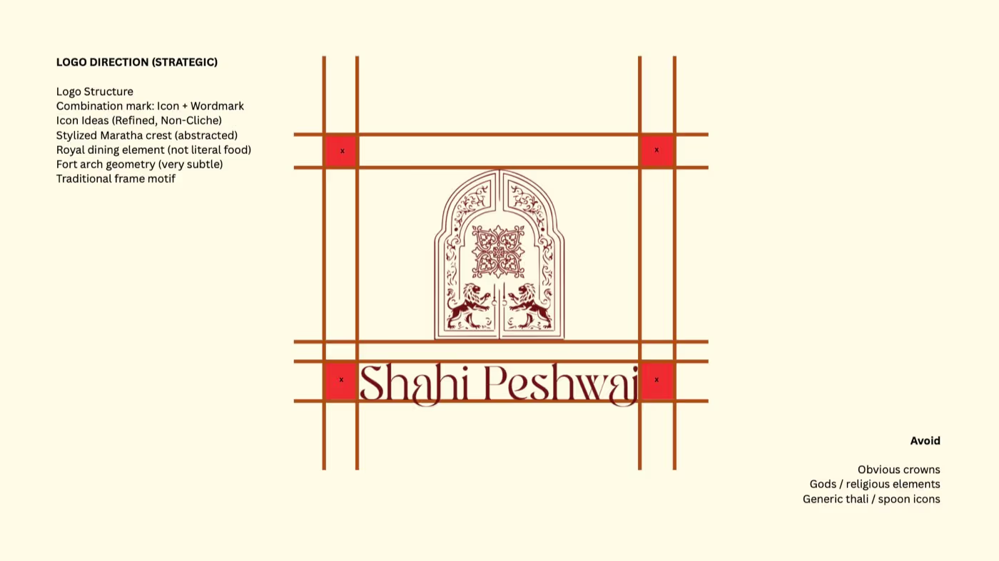
Once the idea is right, the logo almost draws itself. And more importantly, everything after the logo has somewhere to come from.
The system behind the mark
A logo on its own can't set a menu, choose a paper for the bill book or tell a tailor what colour the aprons should be. A brand system can. For Shahi Peshwai that system is short enough to fit on one page:
- One shape. The gateway arch, used as a frame, a window and a pattern.
- Two typefaces. Bailey for the name and the headlines, Montserrat for everything that has to be read quickly.
- Two colours. Maroon and gold, and nothing else competing with them.
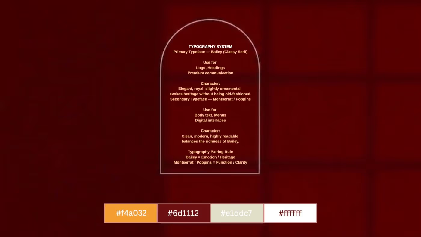
A good brand system is mostly a list of things you've already decided, so nobody has to decide them again at the printer's shop.
This is the part most businesses skip, and it's the part that saves the most money. When the printer asks what colour the takeaway bag should be, the answer already exists. When a new staff member designs a festive post, the fonts are already chosen. Nothing drifts.
Where it has to hold
The real test of a brand isn't the logo presentation. It's the takeaway counter on a busy Saturday. Every object a customer picks up either confirms who you are or quietly contradicts it.
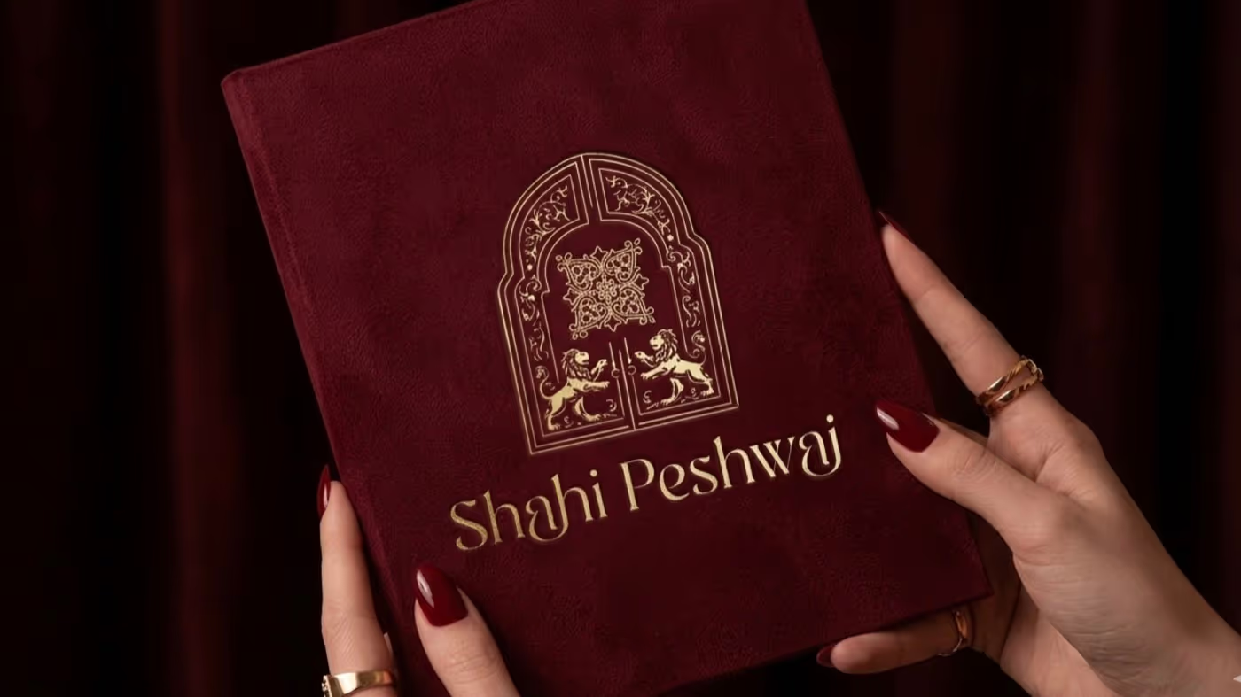 1 Menu book
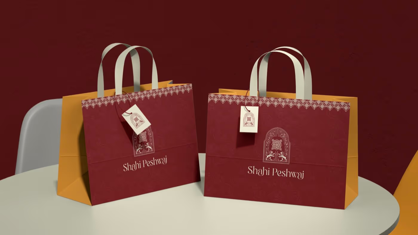 2 Takeaway bags
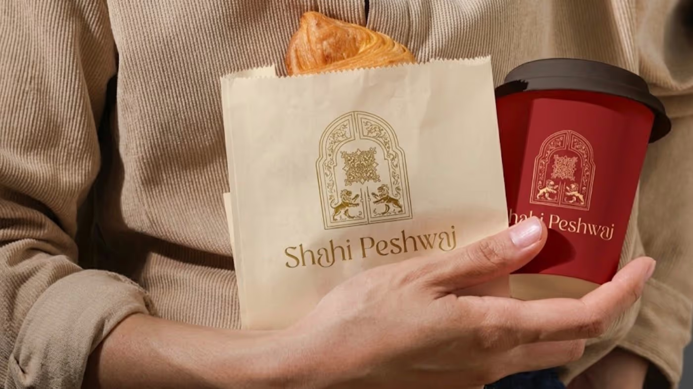 3 Takeaway cup
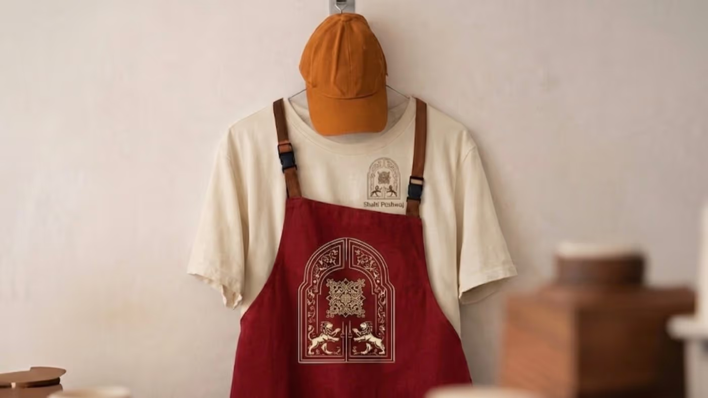 4 Apron
None of these pieces needed a new idea. The arch becomes the frame on the menu cover, the window on the bag, the badge on the apron. That's what makes a customer who took a bag home last month recognise the cup on a friend's table this month.
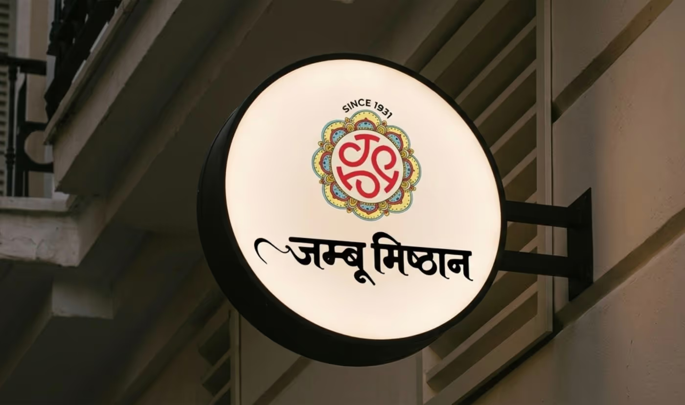
The same thing works at the scale of a sweet shop. Jamboo has been trading since 1931. We rebuilt it around a jali-rosette monogram that reads in both Devanagari and Latin, and it reaches from the shopfront sign to the festive gift boxes.
Start with the idea, not the drawing
If you're about to get a logo made, ask for the idea first. Ask what it will look like on your bag, your bill, your board and your uniform. If nobody can answer, you're buying a drawing, not a brand.
And if you already have a logo you like, you don't have to start over. Most of the time the fix is a system around it: a fixed palette, two typefaces, and a few rules for how the mark is used. That's often the cheapest brand upgrade a local business can make.
If you want help working out what that system should be for your business, tell us about it. We're in Sunder Nagar, Fatehabad, and happy to come and look at your shop.